Birmingham Brand Design Survey: Initial Results
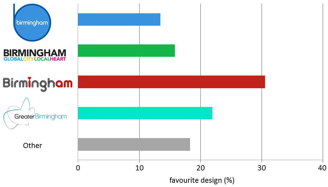
Summary: The design that the greatest number of people liked most was Birmingham I am (30.5%), followed by Greater Birmingham (21.9%).
The least favorite was be birmingham at 13.4%, while 15.8% preferred Birmingham Global City Local Heart.
None of the options were liked by 18.3% of the 82 respondents to this survey which was taken in July 2014 (more responses are invited).
The individual responses are shown below for the most popular design to the least.
Why do you prefer the Birmingham I am design? |
What words come to mind when you look at this design? |
What do you like most about this design? |
What do you dislike most about this design? |
| Simple but modern, it flows | Modern, young, vibrant, innovative | I am | The heart |
| Its more aesthetically pleasing and has a good message | Fun | It is current, not dated and not too formal | n/a |
| Most potential but you lose the idea of 'I am'. It isn't realised yet. | - | - | - |
| It's new, it doesn't remind me of anything used before which is good, it's easy to replicate, it has the heart at it's centre which is relevant, it is striking, it has meaning and can be adapted in many ways plus the other designs look like radio station adverts | Funky, industrial, loving, unusual, strong, playful, self assured | The colours- it doesn't try too hard and the clarity of the font, especially from a distance | Not sure about the tail shape of the 'g' |
| The others look out dated and inappropriate for city or place branding. | smooth, chilled, cool, modern, fun, colourful, contemporary, warm. | Its adaptability to most businesses | it does not look very sophisticated -although it is very detailed |
| SIMPLE | soft friendly kind | typeface | the 'I am' - emphasizes an association that isn't relevant to most people (why would someone want to think that they are Birmingham or represent Birmingham) and which potentially alienates outsiders. It has a danger of being overly egalitarian - too 'eagerly egalitarian'. Improving the image of a city does not mean you have to do this. Promote the benefits - don't tell people how they should think. A common mistake! Just promote the regions benefits to those within and without and, yes, link it to corporate style identity. |
| clever use of name | local pride | word play | - |
| It's inclusive, reflects the diversity and heritage of the city and quirky. It feels like it belongs to people and people belong to Birmingham | Welcoming, diverse, Personal, inclusive, modern, proud | I like the idea of a City with a heart which is the sum of its people. | I looked at the explanation website first and was sold. I'm not sure whether I would get it without the explanation |
| It has the best visual impact - it's clean and clear. | love, pride, ownership | It tells a story quickly | It doesn't say a lot |
| Design of it | i love birmingham | it's better than the others, the 'i am' bit... | the heart |
| Clarity. Plus the strong type and colour scheme | Honestly - 'Birmingham' | - | 'I am Birmingham' already exists |
| Bottom up philosophy rather than a top down inward investment/government thing | Pride, clean, personal | The I am branding | Heart is a bit kischtz |
| contemporary, witty, visual link with the city. possibly not adult though | - | - | - |
| classy but modern font, like the heart, youthful like the city | stands out, promotes city | bright | would prefer another colour other than grey. Grey is not the right image for Birmingham |
| Simpler . . . yet says more without being dated, pretentious or politically divisive | Dunno | The neatness of the "i" and "am" which, after over 40 years living in the city, I had never noticed. (Duh me, eh.) | I quite like the 'wire'-ishness of the mesh .. . if it has more than a glance back at our metal industry past, I'd regret its choice. |
| inventive, welcoming, warm, looks technological, heart of england | - | best of the bunch - others seem bland and "done before" | not sure what the "i am" bit means / is saying, but it's clever |
| I prefer this one, but I am not totally sold | I heart NY | It looks fresh | - |
| Simple message | Inclusive / friendly / clear | Concept | Like to see alternative fonts / designs, possible confusion with heart radio |
| play on words | - | simplicity | love heart is a bit childish |
| Simple eye catching | Love city | - | - |
| Modern, fun and vibrant | Love, Pride, Current | The Colours | The sketchiness |
| Is friendly and speaks to residents not corporations | Pride | - | - |
| It's warm and friendly like Birmingham. | Inclusive, friendly, warm | The fact it says "I am", and the heart above the eye | The font |
| It gives a simple but powerful message of community, which is somewhat lacking of late in Birmingham. | Me, us, we | friendly typography and simple minimalism to make a good message. | People from outside of Birmingham are less likely to enjoy it's appeal and it seems exclusive to those living in Birmingham. Although, I feel that it's more important to have Birmingham's residents warm up to it first and then focus on inter city connectedness. |
| its easy going and fun | friendly | the softness of it and the heart | not that masculine |
Why do you prefer the Greater Birmingham design? |
What words come to mind when you look at this design? |
What do you like most about this design? |
What do you dislike most about this design? |
| It works well. | Network, current, stylish | - | - |
| Cleaner | Stylish | Cleanliness | - |
| It can highlight the identity of Birmingham (2nd largest city in England) | large, diverse, prosperity | The word "Greater" | N/A |
| It shows some sophistications | Business, aspirations, reaching out | Simplicity | I would use deep blue colour |
| more understandable and good play on the word Greater | we are a big player and getting better | Use of the word greater | sqiggly graphi |
| In my mind Birmingham needs to attract more business and corporate activity. This brand offers that call by suggesting a bigger city with sophistication. | Corporate, business, distributed | Offers that Birmingham is a big city. | Not as simple as the others |
| Clean and modern. | Clean | - | I dislike that you need to do survey to choose a logo. |
| Not the design. I prefer the wording. | The 1990s. It is not modern enough. | The 'greater' part. It is the only way we can compete with Manchester. | Typeface is too slender. |
| Simpler bold less fussy | Practical | The warm green tone | Lack of vibrancy |
| It's aspirational. | Digital, business, media | Modern and simple | The word greater seems too geographically linked. |
| Clean, modern and colours | Modern, clean, futuristic, | The swirls as it give the ability to reuse the theme | The word Greater |
| I like the word 'Greater' in front of Birmingham. It's confident. | Classic, tidy, confident. | Its calm simplicity. | I'd like the loops to be more obviously expressive or suggestive of something. |
| It denotes the broader Birmingham region, | It needs to be bolder | It retains the Birmingham name but includes Greater. | The lines around Greater could be stronger and better defined |
| clarity and colour | nuclear, clean, spacious, new | use of colour | it does not communicate qualities of Birmingham, unspecific |
| Fits in with other logos around city | innovation, Movement Buzziness, Excited - electifying (as in Electron) | Not limited | colour |
| Least irritating | Greater, Birmingham, British Leyland, Dumbo | "Greater" is subtle combination of geography (whole region) with ambition (be greater). | Lines and colours slightly insipid |
| More modern looking and representative of wider area around Birmingham | Partnership, working together, forward looking | - | Could be bolder |
Why do you prefer the Birmingham Global City Local Heart design? |
What words come to mind when you look at this design? |
What do you like most about this design? |
What do you dislike most about this design? |
| More attractive design | Pride in birmingham | Colours and symmetry. | Hard to read pink text. |
| Colourful | Colourful and clear | - | Too busy |
| colourful, fun, descriptive | nice, friendly, modern, young, fun, interesting | Fun | white |
| Need to project a global/local image. The message not the design | Multi-cultral BRM.. Local expertise | The message | Not much of a design as such |
| because it says what we are - global city. | international; friendly; large and small | - | - |
| The logo has greater reach but also portrays Birmingham as being local and friendly | Global reach, Shouting louder, True to roots, Warm, Welcoming, Friendly | Colour shows diversity, its vibrant. | The box enclosing it makes it look insular and fortress like. |
| It speaks unity | information, advisory | Simple | - |
| Says what it is | welcome | To the point | - |
| the message | My city as I want others to see it. | The message. No logo. | Can't see the magenta. All words, no logo. |
| simple, clear, bold and to the point. | - | - | No actual logo |
| combines neighbouhood with global scale | not so keen on the design as the statement, design a little boring compared to New York, Barcelona, London, Berlin... | what it statements | boring flat design |
| I prefer greater birmingham - but like the global and local heart so voted for that | Modern | The contrast of global and local and use of heart | Too many colours a bit crowded |
Why do you prefer the be birmingham design? |
What words come to mind when you look at this design? |
What do you like most about this design? |
What do you dislike most about this design? |
| clean and contemporary | professional | colour and clever design | short stalk of the B |
| it's simple, eye catching and focuses on the word Birmingham | traditional, conservative, blue grass, with a contemporary twist. | it focuses on Birmingham | The blue colour is cold, masculine and too conservative |
| clear impactful | Birmingham | colours / clarity | not sure "be" leaps out |
| friendly, welcoming | sunny, warm, friendly | colour, shape | - |
| Nice font lower case more welcoming | Welcoming | The font | The colours |
| it's 2014 | young, innovative, changing | easy on the eye and it's v memorable and instantly recognisable | - |
| It's simple and clean. | Clean, clear, precise, Birmingham, | The fact that it's clear | - |
| unifies the birmingham area | cool | direct simplicity | birmingham has to be small to fit inside the b, could it run across? |
| simple | central | simple | not sophisticated? but then neither is an apple |
| it's simple | simple, clear, | The clarity | it doesn't say a lot |
| simple, clean three colours | Midlands, | - | - |
Why do you prefer none of the selected designs? |
What words come to mind when you look at this design? |
What do you like most about this design? |
What do you dislike most about this design? |
| I think it needs a more dramatic up todate design | old fashioned | - | - |
| Don't like it at all | Old, dated, corporate, capitalist, | Don't like any, we have so many talented creatives in the city, look at orb agency for example is this really the best we can do | All the same as the awful things we've seen come out of Birmingham / marketing Birmingham for years, |
| The more I look the more dissapointed I am | Boring, undynamic, reinforces negative steriotype of the city. | zero. | Design needs to reflect the amazing design, manufacturing heritage of the city. Just walk around the museum see some of the beautiful world class jewellery. These designs are boring and will do nothing to fullfill the brief. |
| All four are poor - trying to do too much. Covers all the bases - you need UK as people will think of Bham Alabama. Black Country people may not be happy with Greater Birmingham but are part of the UK West Midlands | Want to know more about a confident part of the UK I have not looked into too deeply before | Existing designs are just very, very below par. Its nice to have 'heart' but the design should project the region's competence, in all fields | Birmingham & The West Midlands UK with strong font can be used to build around, with Birmingham UK and The West Midlands UK also being used indepently, with a set of strong icons to work with it - arts, science, manufacuring, ... |
| They all add irrelevant, distracting, detail to the name. | Yet another incompetent marketing company at work. | There's nothing to like or dislike when I merely want information. | Attempting to DO things to me instead of merely providing information |
| - | Rain, dirty concrete, corporate inertia, parochialism | - | - |
| i dont , secondly whats it for when will it be used and for who | provincial | - | - |
| If Birmingham is to adopt another logo (this isn't what I understand to be 'branding') it needs to be genuinely innovative and not a typographic exercise | Predictable, dull and unimaginative | - | Predictable, unimaginative and potentially damaging to Birmingham's reputation if it were to be adopted |
| I prefer #Birmingham: The City of Enlightenment | Brilliant #Birmingham | - | That it says nothing about #Birmingham's history and heritage which is precisely why I prefer #Birmingham: The City of Enlightenment |
| All the others are ugly apart from the second which is just cliched | The 1990s logo? Mainly... erm, 'Europe's meeting place' | The 1990s design just looked good and right | The cessation of its use in the early 2000s |
Thanks for your interest. Feel free to tweet us @brumwear or email us if you have any questions about this survey about the brands of Birmingham.
Here we respond to the questions and critical points raised above:
>Don't like any, we have so many talented creatives in the city...
Our team sought advice from local creatives and is collaborating with designers at Shaded Rose, which is based in the Custard Factory.
>All the same as the awful things we've seen come out of Birmingham / marketing Birmingham for years
This is a citizen-driven project that arose from the grass roots; it is not paid for or run by Birmingham City Council, Marketing Birmingham or any other similar organisation.
>Design needs to reflect the amazing design, manufacturing heritage of the city. Just walk around the museum see some of the beautiful world class jewellery. These designs are boring and will do nothing to fullfill the brief.
The circular rings that form springs within the letters and adorn the heart echo the jewelry making and metal bashing origins of our region, and reflect the flexibility and adaptability of our city.
The design is described in greater detail here.
>you need UK as people will think of Bham Alabama.
The design can be rendered with UK colouration, a Union Jack or England's heart.
>Black Country people may not be happy with Greater Birmingham but are part of the UK West Midlands
The people of the Black Country are of foremost importance to our region's identity, and are celebrated in our list of notables.
>Its nice to have 'heart' but the design should project the region's competence, in all fields
The region's competencies are many and varied, and each can be displayed above and below the "am" on the design, as in the Spitfire version.
>They all add irrelevant, distracting, detail to the name.
The core of the design proposed by Brumwear is minimalist; only the word Birmingham with a custom typeface which is based on the region's identity.
>Yet another incompetent marketing company at work.
This work was created by citizens who consulted with the people of Birmingham and the West Midlands, and not by a marketing company.
>whats it for when will it be used and for who
This project is intended for the people of Birmingham and its neighbours to use and create images that celebrate our people, places and products. The designs are available to be used now.
>If Birmingham is to adopt another logo (this isn't what I understand to be 'branding') it needs to be genuinely innovative and not a typographic exercise
We have sought to do more than simply propose another logo, there is a variety of ways our designs can be be used and adapted in its totality and component features.
The typeface is original, as is appropriate given Birmingham's inventive nature, and reflects the region's long-standing focus on design and innovation.
The basis of our design is described in greater detail here.
>Predictable, unimaginative and potentially damaging to Birmingham's reputation if it were to be adopted
The reputation of Birmingham is foremost in our minds and is celebrated in the video and images on our website.
Birmingham's lack of a clear, strong and positive brand is damaging, as evidenced by the recent spate of stories in the press.
>it says nothing about #Birmingham's history and heritage
The history and heritage are major assets of our city and region, as we have described and can be reflected in versions of the design.
>The 1990s logo? Mainly... erm, 'Europe's meeting place'
We agree that Birmingham is a great place to meet for virtually anyone, and list some of the venues. The design is intended to be inviting and adaptable for useful for meeting announcements.